CASE STUDY
-
E-COMMERCE
Sustainable
E-Commerce App
ROLE
UX/UI Designer
TOOLS
Figma
01 - OVERVIEW
Meet
Sustainibuy
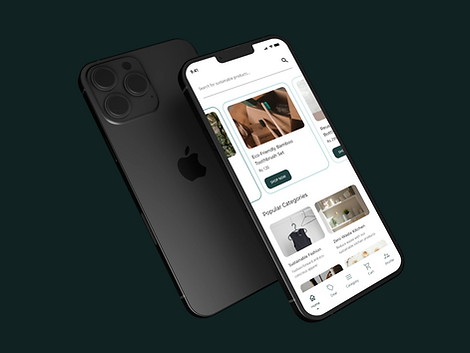
An innovative e-commerce platform committed to promoting a sustainable and eco-friendly lifestyle. The mission: make it easier for consumers to discover and purchase products that align with their values of environmental responsibility and conscious living.
By curating a wide range of ethical, sustainable, and eco-friendly goods, Sustainibuy empowers individuals to make choices that are better for both people and the planet.
02 - UX RESEARCH & PERSONAS
Who are we
designing for?
I used competitor analysis (Etsy, Thrive Market, EarthHero, Package Free Shop, Made Trade) to gather UX/UI insights focusing on sustainability, then identified common pain points to create two detailed user personas.
Emily
EC0-CONSCIOUS SHOPPER
-
Shops frequently online for sustainable goods
-
Values clear eco-certifications on products
-
Frustrated by hard-to-navigate green product sites
-
Wants to know the environmental impact of each purchase
John
SUSTAINABILITY-CURIOUS BUYER
-
New to sustainable shopping, needs guidance
-
Wants simple comparisons between products
-
Appreciates clear product descriptions and reviews
-
Motivated by cost savings alongside sustainability
03 - USER JOURNEY & FLOW
The shopping
experience
I mapped the full user journey from app discovery to purchase completion, highlighting key touchpoints and pain points for each persona.
STEP 01
Discover
App store or referral, onboarding introduction to Sustainibuy's mission
STEP 02
Browse
Category exploration with sustainability badge filtering
STEP 03
Product
Detail page with eco-impact info, reviews, and alternatives
STEP 04
Cart
Cart review with summary and promo codes
STEP 04
Checkout
Streamlined payment flow with
USER FLOW CHART

04 - INFORMATION ARCHITECTURE
Structuring the
experience

05 - VISUAL DESIGN
The eco
visual language
The interface embraces an earthy and minimal aesthetic using natural tones, generous spacing, and simple product presentations. The design reflects sustainability, authenticity, and conscious shopping through a warm and elegant visual experience.
COLOR
Deep Teal
Warm Charcoal
Sage Green
Soft White
Medium Gray
Black
TYPOGRAPHY
HEADINGS — MONTSERRAT
Discover Eco Products
BODY — OPEN SANS
Shop products with verified eco-certifications and clear environmental impact scores for every item.
06 - COMPONENTS
Building the
designing for?
Each component was crafted to enhance the user experience and align with the sustainability focus. Key components include action buttons, eco-badges, product cards and filtering controls.

07 - WIREFRAMES & HIGH-FIDELITY
From sketch
screens
WIREFRAMES

HIGH FIDELITY

MOCKUP

08 - DESIGN RATIONALE
Why it
works
Colors & Typography
Chosen colors and Open Sans create a modern, eco-friendly aesthetic that resonates with environmentally conscious users
UX Principles
Design emphasizes simplicity, consistency, and accessibility — ensuring a seamless user experience across all screens
Persona-Driven Design
Meets Emily and John's needs through intuitive navigation, clear product information, and sustainability focus throughout
Accessibility
Vertical panels restack cleanly while maintaining readability and hierarchy on smaller screens
08 - FEEDBACK & ITERATION
Closing the
loop
HYPOTHETICAL FEEDBACK
"Make the Shop Now button more prominent."
Stakeholders suggested improving the CTA visibility to improve conversion on the homepage.
IMPLEMENTATION
Increased button size and adjusted the color contrast for better visibility - ensuring it draws user attention effectively without disrupting the surrounding layout.
By actively seeking and incorporating feedback, the design was continuously improved to meet user needs across each iteration cycle.