CASE STUDY
-
IOT | SMART HOME AUTOMATION
Smart Vacuum
Bot Control Dashboard
ROLE
UX/UI Designer
TOOLS
Figma
TEAM
1 Designer, 1 Developer
01 - OVERVIEW
What was
this project?
This project involved designing a dashboard interface for controlling and monitoring a smart vacuum cleaning device used in a factory environment. The app allows workers to monitor robot status, manage cleaning schedules and control the device through an intuitive interface.
The design needed to work for both literate and semi-literate factory workers prioritising visual communication over text throughout every screen.

02 - GOAL
Designing for
all workers
The main goal was to create an interface usable by both literate and semi-literate factory workers. This meant the design had to communicate everything visually - icons, colour, and layout doing the heavy lifting instead of text.
01
Minimize reliance on text - icons and visual indicators carry the meaning
02
Use colour-coded indicators (green / amber / red) for battery, water level and robot condition
03
Provide quick access to robot controls through large, clearly labelled touch targets
04
Allow workers to monitor system status and active tasks at a glance from one screen
03 - ALL SCREENS
The complete
screen set


04 - SCREEN BREAKDOWN
What each
screen does
Login / Welcome Screen
Allows workers to securely log in using Staff ID and PIN.
Main Dashboard
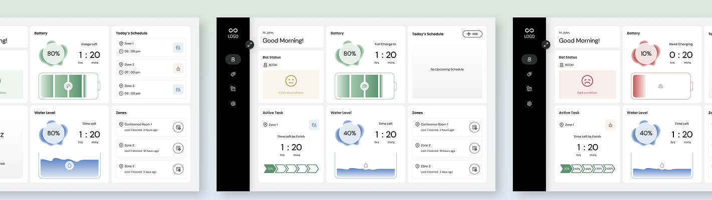
Provides an overview of bot health, battery, water level, schedules, and real-time cleaning status. Includes Idle, Active Task and Low Battery Alert states.
Room Detail Screen
Displays room-specific cleaning information, live cleaning progress, activity logs, controls and upcoming schedules. Includes normal room view and active cleaning state.
Schedule Modify Modal
Allows users to edit cleaning schedules by selecting the day, time, cleaning type and assigned bot.
Manual Control Screen
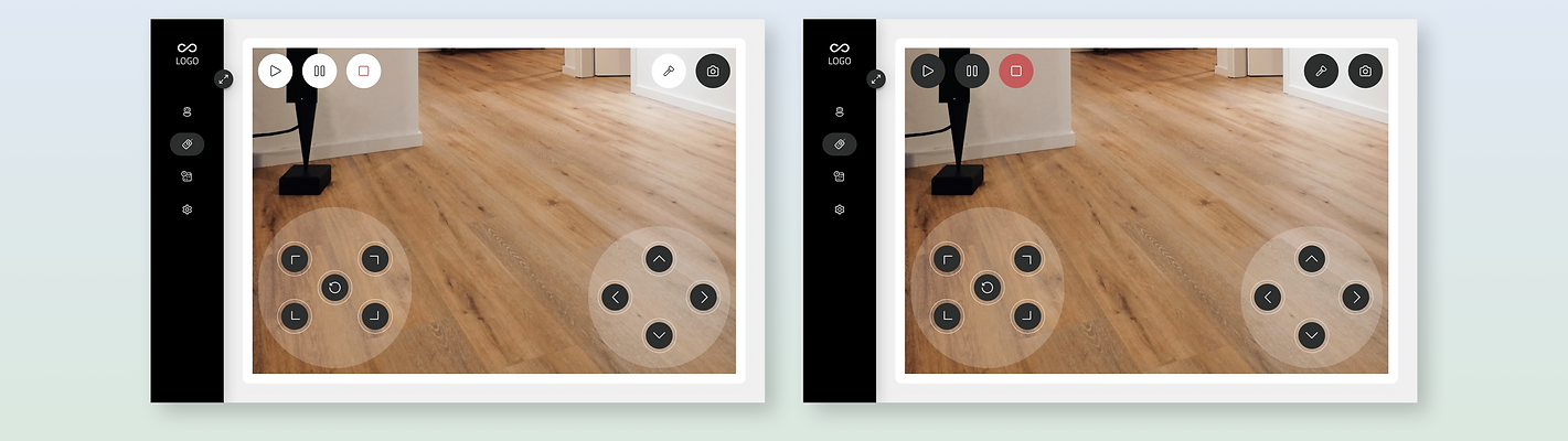
Allows workers to monitor the robot through a live camera feed and manually control movement with play, pause and stop states.
05 - KEY DECISION DESIGN
The manual control
three-column layout
The manual control screen is the most complex screen in the app. Workers need to see where the robot is going, control its direction, and manage playback - all at the same time. The three-column split solves this without requiring any screen switching.
WHY IT WORKS
Monitor and control simultaneously
In a noisy factory environment, switching screens to control and then check the camera feed wastes critical seconds. Keeping all three panels in one view means workers never lose situational awareness.
LEFT PANEL
Play / Pause / Stop controls - clear iconography, large touch targets, colour-coded active state (green play, red stop)
CENTRE PANEL
Live camera feed - real-time robot POV, full-width visibility of the factory floor environment
RIGHT PANEL
D-pad directional navigation - large circular buttons for forward, back, left, right, and rotation controls
06 - SYSTEM STATE DESIGN
Three dashboard
states
The main dashboard was designed in three distinct states - each communicating the robot's condition purely through colour and icon changes, with no text labels needed to understand the urgency level.
GOOD CONDITION
Normal Operation
Battery 80% (green gauge), Water 80% (blue fill), Bot Status shows a smiling face icon - all systems operating normally, worker can proceed
CRITICAL CONDITION
Cleaning in Progress
The robot is still cleaning, but the water level is at 40% (warning/monitor level). The status shows a neutral/straight smile icon indicating a warning state and water should be refilled soon to avoid interruption.
BAD CONDITION
Need Attention
Battery 10% (red gauge, 0:20 charge time shown), sad face icon replaces smiling face, water still 40% — immediate visual alert even for non-literate workers
07 - VISUAL DESIGN
Built for
the factory floor
The interface uses a clean, light base with structured card sections - functional rather than decorative. Large touch targets and bold typography ensure usability in active factory settings. The colour system carries all critical meaning.
STEP 01
Colour-coded status
Green / amber / red for battery, water, and robot condition — universally understood without reading
STEP 02
Card-based layout
Structured grid separates battery, water, bot status, active task, schedule — each card scannable independently
STEP 03
Large touch targets
Detail page with eco-impact info, reviews, and alternatives
STEP 04
Icon-first navigation
Play, pause, stop, condition icons - all core states conveyed by icons before any text label
COLOR SYSTEM
System Green
Amber Alert
Critical Red
Clean White
08 - CHALLENGE & SOLUTION
Getting the indicators
exactly right
THE CHALLENGE
Battery & water indicators that speak without words.
These indicators needed to communicate system status clearly and instantly - for workers who may not read well. The design had to convey normal, warning, and critical states in under one second, using only visual signals.
THE PROCESS
Explored multiple indicator styles in Figma - circular gauges, bar fills, segmented displays
Tested different colour schemes and fill metaphors across several design iterations
Combined three signals together: colour + fill level + supporting icon (smiling/sad face)
Final circular gauge design allows instant recognition - full green vs. thin red at a glance
Same visual language applied to water tank fill indicator for system consistency
09 - OUTCOME
What made it
rewarding
"The most rewarding aspect was designing an interface that allows factory workers to quickly understand the robot's status and operate it efficiently - with minimal reliance on text, working equally well for literate and semi-literate users."