
01 - OVERVIEW
What was
this project?
This project involved a full UX and UI redesign of a real estate website for a Dubai-based agency helping clients buy, sell and invest in property.
Alongside the website, I also designed a new admin portal used to manage leads, blog content and property listings - creating a complete end-to-end design system for the brand.

02 - GOAL
The objective
Transform the existing website into a more structured, visually engaging and informative platform that clearly communicates the company's services and helps users easily explore property listings.
03 - PROBLEM
What was
broken?
01
Layout was very plain - mostly images and text with no structural hierarchy
02
Limited information about services and property offerings
03
Weak visual hierarchy made it hard to scan and understand content
04
Lack of a clear brand identity or consistent visual language
05
Users could not easily understand the business value or what was being offered
04 - RESEARCH & PLANNING
Learning the
landscape
I began by gathering project requirements and reviewing available brand assets - the logo, brand colors and existing website content. To understand industry standards, I researched similar real estate websites analyzing content structure, property listing presentation and key sections commonly used across the category.
This research helped identify useful layout patterns and information hierarchy improvements that could transform the user experience.
REVIEWED
Brand logo · Brand colors · Existing site content
SEARCHED
Competitor real estate sites · Content structure · Property listing layouts · CTAs
IDENTIFIED
Key sections · Layout patterns · Information hierarchy improvements
05 - DESIGN PROCESS
How I
designed it?
01
Structured Layouts
Created structured layouts for each section of the website from scratch in Figma
02
Components
Designed reusable components to maintain visual consistency across all pages
03
Client Feedback
Iterated through multiple feedback cycles incorporating client and reference site inputs
04
Refinement
Aligned the final design with the client's vision through progressive iteration
06 - VISUAL DESIGN
The asthetic
The visual style reflects a luxury real estate brand identity, combining elegant typography, premium imagery, and a sophisticated color palette. Spacious layouts, refined visuals, and strategically placed call-to-actions create a high-end browsing experience while reinforcing trust and exclusivity.
COLOR SYSTEM
Primary
Neutral
Background
Primary Text
Secondary Text
Tertiary Text
Error / Required
Coming Soon
Ready to Move
Under Construction
TYPOGRAPHY SYSTEM
HEADINGS & SUBTITLE
Lora
SemiBold & Medium · H1-H4 · Subtitles
64px → 24px scale
BODY, BUTTONS & LABELS
Nunito
Regular, Bold · Body · CTAs · Nav
24px → 14px scale
07 - SCREENS
UI design
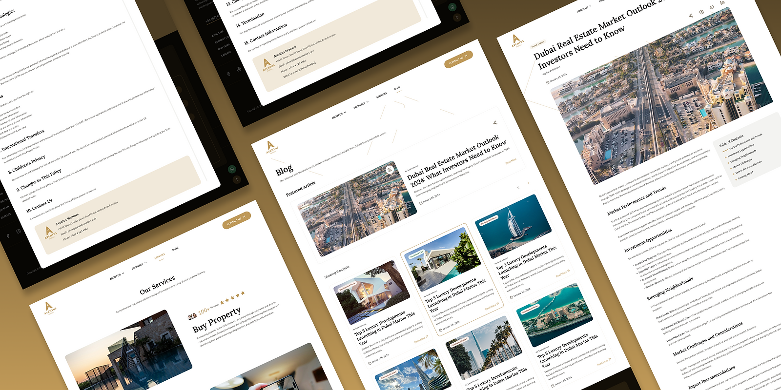
Designed with clear information hierarchy, immersive property imagery and structured sections guiding users from discovery to inquiry.
DESKTOP SCREENS


MOBILE RESPONSIVE SCREENS

08 - CHALLENGE & SOLUTION
The hard
broken?
THE PROBLEM
The services section broke the design system.
The client requested a specific card structure for the services section that differed significantly from the rest of the website's design style. I was concerned it would break the overall visual consistency and premium feel of the site.
THE SOLUTION
Created multiple design variations for the services section
Balanced the client's specific requirements with the existing design language
Reviewed all options collaboratively
Went through several iterations until visual harmony was restored
Selected a final version that met expectations without compromising the brand feel
09 - ADMIN DASHBOARD
Beyond the
website
In addition to the public website, I designed a full admin dashboard allowing the team to manage property listings, leads and inquiries and blog content - all from a single, structured interface.
While designing the admin portal, I had to consider what information the admin would add or edit, how that content would appear on the public site and how to structure the interface for efficient day-to-day management.
Leads & Inquiries
Track and manage incoming user inquiries and lead pipeline from the website
Blog Content
Create, publish, and manage blog posts and editorial content directly from the portal
Property Listings
Add, edit and manage all property listings including images, pricing and details
ADMIN DASHBOARD SCREENS

10 - OUTCOME
What made it
rewarding
"The most rewarding part was transforming a simple image-based layout into a well-structured, visually refined platform -
improving how the brand is communicated and making it easier for users to explore property listings."