CASE STUDY
-
E-COMMERCE
Bookwave -
E-Library Platform
ROLE
UX/UI Designer
TOOLS
Figma
01 - OVERVIEW
Reading brought
to your fingertips
Bookwave is a clean, minimalist, editorial-inspired and user-friendly digital platform where readers can explore a vast collection of e-books and audiobooks, borrow their favorites with ease, and immerse themselves in captivating stories anytime, anywhere.
With intuitive navigation, personalized recommendations, and seamless borrowing options, Bookwave brings the joy of reading to your fingertips - wherever you are, on any device.

02 - COMPETITOR RESEARCH
Learning from
7 platforms
Before designing Bookwave, I conducted a structured competitor analysis across 7 major e-library and audiobook platforms - studying their typography, color strategy, brand identity, and user-centric design principles. The goal was to identify what works and make informed design decisions.
TYPOGRAPHY INSIGHT
Sans-serif wins for digital
Arial, Helvetica, Roboto and Open Sans dominate - chosen for screen readability. Serif fonts are used selectively for headings to add personality without hurting legibility.
COLOR INSIGHT
Neutrals + one accent
Blue, white, and gray dominate for professionalism and readability. Accent colors (orange, green, red) are used sparingly to guide interaction without overwhelming the content.
UX INSIGHT
Content first, always
Every competitor prioritizes minimalist, clean design to put content at the forefront. Personalization, intuitive navigation and accessibility features are the most common UX differentiators.
UX PRINCIPLES APPLIED TO BOOKWAVE
Personalized Recommendations
Algorithms to suggest e-books and audiobooks based on reading history and genre preferences
Intuitive Navigation
Clear menus with quick access to browsing, borrowing, and account management
03 - INFORMATION ARCHITECTURE
Structuring the
experience
BOOKWAVE SITEMAP

04 - BRAND IDENTITY
Logo, color
& typography
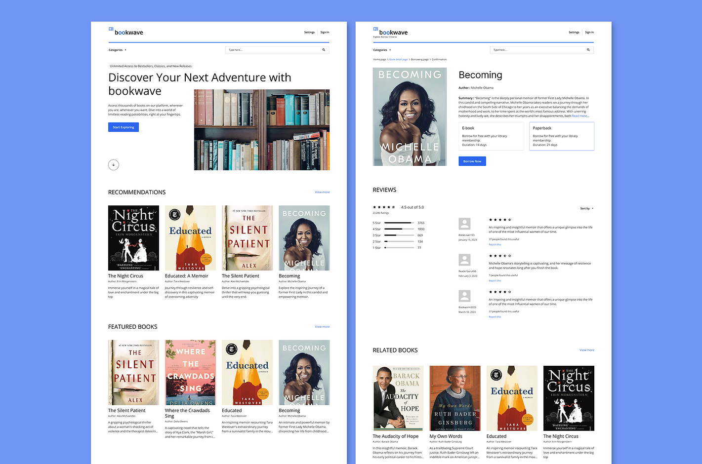
A clean, minimalist and editorial-inspired interface that prioritizes readability, content discovery and intuitive navigation. Structured grid layouts, generous whitespace, subtle blue accents and typography-led hierarchy create a professional and user-friendly reading experience.
LOGO
Clean, modern design with book icon and "Bookwave" in Open Sans Semibold - soft blue, light gray, and white palette

COLOR SYSTEM
Soft Blue
Light Grey
Background
Primary Text
Secondary Text
TYPOGRAPHY - OPEN SANS
Regular 400 — Headings
Explore E-Books
Regular 400 — Body
Borrow your favorite books and immerse yourself in captivating stories anytime, anywhere with Bookwave.
05 - WIREFRAMES & HIGH-FIDELITY
From sketch
to screen
WIREFRAMES

DESKTOP SCREENS

06 - SUMMARY
What Bookwave
achieves
"Bookwave proves that a reading platform can be as delightful to use as the books within it - where clean information architecture, soft trusted colors and consistent typography come together to make digital borrowing feel effortless."