CASE STUDY
-
E-COMMERCE
ABC Rewards App
Landing Page
ROLE
UX/UI Designer
TOOLS
Figma
01 - OVERVIEW
One page to
drive downloads
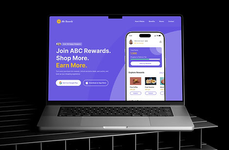
The ABC Rewards landing page is crafted to clearly communicate the value of the ABC Rewards app - encouraging users to join and start earning points through everyday shopping.
The landing page is strategically structured to guide visitors towards downloading the app from Google Play or the App Store, with strong call-to-action buttons positioned at both the top and bottom.
02 - CORE USER JOURNEY
Four steps,
one loop
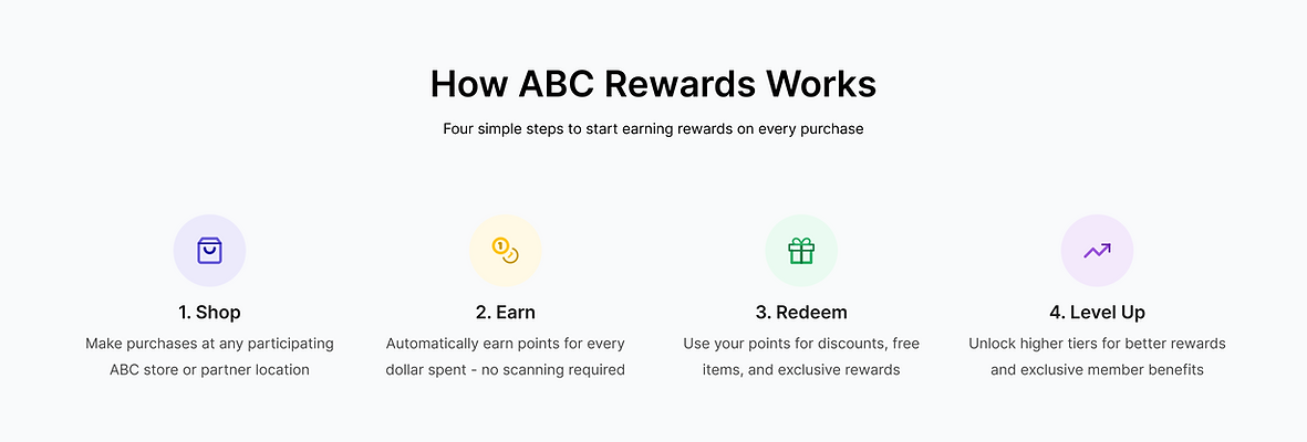
The central UX decision was reducing the rewards program to its simplest mental model - a four-step loop that any user understands in seconds. This became the structural backbone of the entire page.
03 - RESEARCH & PLANNING
Fast, AI-assisted,
focused research
With a tight 6-hour timeline, I used a hybrid approach - combining manual inspiration gathering with AI tools to accelerate ideation and competitive benchmarking without sacrificing design quality.
COMPETITIVE RESEARCH
ChatGPT
Used ChatGPT to quickly analyze loyalty program landing pages at scale - identifying common patterns, content strategies and what drives sign-up conversions in this category
RAPID IDEATION
v0 by vercel
Used v0 by Vercel for rapid UI generation and layout ideation, enabling quick exploration of multiple interface directions before refining designs in Figma and reducing time in the early design phase.
VISUAL INSPIRATION
Manual Sourcing
Reviewed design portfolios and loyalty program landing pages to identify effective visual patterns then used findings to inform the purple/yellow color strategy and typographic hierarchy
04 - VISUAL DESIGN
Purple authority,
yellow energy
The landing page features a modern, vibrant color scheme dominated by a rich purple background complemented by bright yellow accents that draw attention to key action items and highlights.
COLOR SYSTEM
Primary
Secondary
Accent 1
Accent 2
Accent 3
Accent 4
TYPOGRAPHY SYSTEM
HEADINGS & SUBTITLE
Inter
Bold, SemiBold · H1-H3 · Subtitles
64px → 20px scale
BODY, BUTTONS & LABELS
Inter
Regular, Medium · Body · CTAs · Nav
16px → 14px scale
05 - SCREENS
UI design
DESKTOP SCREEN

06 - CONVERSION STRATEGY
Every scroll moves
toward the download
CTA ARCHITECTURE
Page designed as a conversion funnel.
Each section systematically addresses a potential hesitation - building desire, establishing trust and removing doubt - before presenting the final download CTA. The structure mirrors a user's natural decision-making journey.
01
HERO CTA - ABOVE THE FOLD
App Store + Google Play buttons visible immediately - capturing intent before the user scrolls
02
4-STEP JOURNEY - BUILD UNDERSTANDING
Simplifies the program - eliminating confusion about how rewards work
03
BENEFITS SECTION - BUILD DESIRE
Exclusive deals, birthday rewards, and VIP tiers make the value tangible
04
TESTIMONIALS - BUILD TRUST
Real customer experiences address final hesitations and provide social proof
05
BOTTOM CTA - CATCH COMITTED USERS
Repeat download buttons for users who scrolled fully — the highest-intent visitors