Ecommerce
Sustainable E-Commerce App
Tools Used
Figma
Role
UX/UI Designer
Timeline
6

An innovative e-commerce platform committed to promoting a sustainable and eco-friendly lifestyle. Our mission is to make it easier for consumers to discover and purchase products that align with their values of environmental responsibility and conscious living. By curating a wide range of ethical, sustainable, and eco-friendly goods, we aim to empower individuals to make choices that are better for both people and the planet.
UX Research and Personas
I began the project by using ChatGPT to gather detailed information about competitors such as Etsy, Thrive Market, EarthHero, Package Free Shop, and Made Trade. I collected insights on their strengths and weaknesses in both UX and UI, and information focusing on sustainability up to the year 2022. Additionally, I examined their screens to pinpoint common pain points and then used all this information to create two detailed user personas.

User Journey Map
To understand the typical shopping experience on Sustainibuy, I created a user journey map. This map outlines the steps from discovering the app to making a purchase, highlighting key touchpoints such as browsing products, reading product details, and checking out. Potential pain points identified for each persona were addressed through thoughtful design solutions.

User Flow Chart

Information Architecture

Color
The design features a cohesive color palette of deep forest green, Warm Taupe, sage green, and light gray, which aligns with the eco-friendly theme.

Typography
The chosen fonts are Montserrat for headings and Open Sans for body text. Montserrat is a sans-serif typeface known for its modern, clean lines, which make it highly readable and suitable for digital interfaces. It works well for headings due to its bold presence and geometric simplicity. Open Sans, also a sans-serif font, is used for body text because of its warmth and stability, which enhances readability and complements the modern aesthetic of Montserrat.

Components
Each component was crafted to enhance the user experience and align with sustainability focus. Buttons in Deep Forest Green highlight key actions, while sustainability badges in Sage Green provide instant eco-friendly cues. Cards for product listings and categories feature clean lines and high-quality images for seamless navigation. Radio buttons and checkboxes use subtle color variations for clarity. Each design choice ensures a harmonious, accessible, and aesthetically pleasing shopping experience.

Wireframe

High Fidelity
Home Page

Product Category Page Sustainable Fashion

Product Details Page

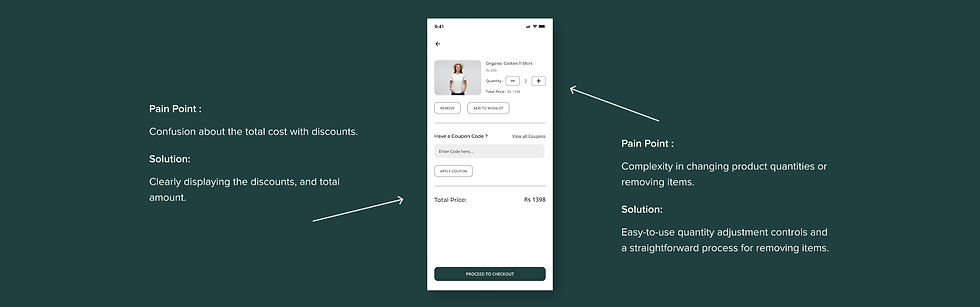
Shopping Cart
Checkout Process

Design Rationale
Colors and Typography
The chosen colors and Open Sans font create a modern and eco-friendly look.
UX Principles
The design emphasizes simplicity, consistency, and accessibility, ensuring a seamless user experience.
Personas
The design meets the needs of Emily and John by providing intuitive navigation, clear product information, and a focus on sustainability.
Accessibility and Usability
Ensured by high contrast, readable fonts, and straightforward interaction flows.
In handling feedback from stakeholders, I adopt a collaborative approach, incorporating suggestions to iterate on the design.
For example, if a stakeholder suggests improvements to the checkout process, I evaluate the feedback and implement changes to enhance user experience.
By actively seeking and incorporating feedback, I aim to continuously improve the app's design and meet user needs effectively.
Example :
Hypothetical Feedback:
Stakeholders suggested making the "Shop Now" button more prominent.
Implementation:
I increased the button size and adjusted the color for better visibility, ensuring it draws users’ attention effectively.

